We know that discretizing or binning the continuous variables in modeling is almost always a bad idea. We lose information that contains in a continuous variable after discretizing it. However, we may not realize that it can be misleading if we extract insights after binning the continuous variable the wrong way.
To illustrate this point, I will continue to use the Telco Customer Churn data set that was used in my previous posts. We will look at the MonthlyCharges variable and create bins for it using three different methods: 1. equal length binning method. 2. quantile binning method. 3. weight of evidence (WOE) binning.
1.Equal Length Bins
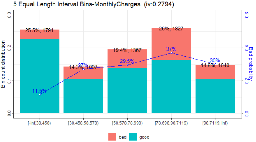
We can use cut() function in the base package to create bins of equal length intervals. We bin the MonthlyCharges into 5 equal length bins. Each interval is about 20 in length. The plot is generated using woebin_plot() function. Since the function evolved from credit scoring world, it is generally described as a measure of the separation of good and bad customers. “Bad Customers” refers to the customers who churned. and “Good Customers” refers to the customers who stayed. The code is as follows.
library(scorecard)
library(ggplot2)
library(ggplotify)
library(plotly)
library(tidyverse)

customer_churn_raw_tbl <- read.csv("/yourdirectory/Telco_Customer_Churn.csv")

## pre-process the data to drop the NA rows of the TotalCharges column
customer_processed <- customer_churn_raw_tbl %>%
  drop_na(TotalCharges)

customer_processed$MC5 <- cut(customer_processed$MonthlyCharges,breaks=5)
MC5list=list(MonthlyCharges=sort(parse_number(as.character(unique(customer_processed$MC5))))[c(-1)])
MC5bins = woebin(customer_processed[, c('MonthlyCharges', 'Churn')],
                 y = 'Churn',positive = 'Yes', breaks_list=MC5list)
p<-woebin_plot(MC5bins$MonthlyCharges, title="5 Equal Length Interval Bins")$MonthlyCharges
The code created the following plot. It seems that the higher the monthly charges, the higher the churn rate from this graph. I have seen such conclusions made by data scientists on the internet.

2. Quantile Bins
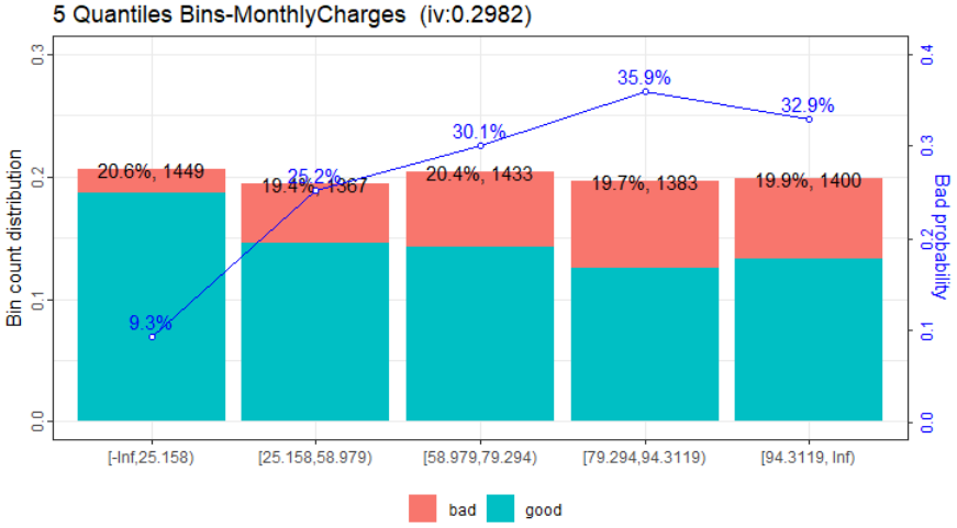
We used the quantcut() function in the gtools package to create the intervals using the quantiles of the MonthlyCharges variable. The rbin package can also be used to create quantile bins. From the Quantiles bins plot, it seems that we can also make conclusions that higher monthly charges lead to higher churn rate.

3. WOE Bins
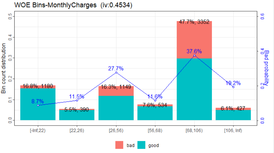
We used the scorecard package’s woebin() function to create the WOE bins. The weight of evidence tells the predictive power of an independent variable in relation to the target variable. WOE is calculated by taking the natural logarithm (log to base e) of division of % of non-events and % of events (churn, default on loan etc.)
Weight of evidence (WOE)-based binning of continuous variables can offer complimentary insights, by creating distinct value segments, based on its relationship to an outcome variable of interest, that differ in some significant way. For this reason, the bins determined using this method is more meaningful than arbitrarily determined bin widths.

We see that the above plot identified two groups of customers that are more likely to churn, one group paying $26-56/month and another paying $68-106/month. This could be of interest for the company as these may indicate that the company needs to adjust its pricing strategies. Most interestingly, the plot shows that most customers are in the $68-106/month bucket, which poses a potentially significant problem to the company because these customers are also much more likely to churn than the rest.
End Notes
I hope this post clearly demonstrates how important it is to use the right approach for binning in insight discovery from continuous data. The WOE binning approach identified insights that are not evident in other approaches.
Thank you!!1
Useful information
Useful information
–