A graph is worth a thousand words, though not always. Not all graphs are created equal. I would say a great graph is worth a thousand words. What is a great graph?
Let’s start from scratch to construct a great graph to show you how to get to one. The data I used is from R4DS. Below is how we can obtain the data and construct a scatter plot to examine the relationship between two variables.
library(tidyverse)
student_ratio_raw <- readr::read_csv("https://raw.githubusercontent.com/rfordatascience/tidytuesday/master/data/2019/2019-05-07/student_teacher_ratio.csv")

library(WDI)

WDIdata <- WDI(indicator = c("iso3c", "NY.GDP.PCAP.CD", "SP.POP.TOTL"), start=2015,end=2015, extra=TRUE) %>%
           mutate(country_code = as.character(iso3c)) %>%
           mutate(GDP_per_capita = NY.GDP.PCAP.CD, total_population=SP.POP.TOTL) %>%
           tbl_df()
student_ratio_elementary_2015 <- student_ratio_raw %>%
  filter(indicator == "Primary Education", year==2015) %>%
  arrange(desc(student_ratio)) %>%
  inner_join(WDIdata, by="country_code")

student_ratio_elementary_2015 %>%
  ggplot(aes(GDP_per_capita, student_ratio)) +
  geom_point()
Step 1: Construct a scatter plot to check on the relationship between student ratio and GDP per capita. They are expected to have a negative relationship. Richer country has a low student to teacher ratio. However, the relationship is not very clear from the first graph.

Step 2: Apply the log transformation on the two right skewed variables. The negative relationship becomes much more clearly.
student_ratio_elementary_2015 %>%
  ggplot(aes(GDP_per_capita, student_ratio)) +
  geom_point() +
  scale_x_log10() +
  scale_y_log10()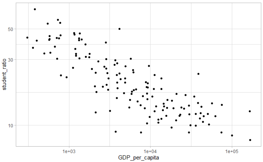
Step 3: Add in labels of the country and add the graph title and axis labels so that we can understand what the graph depicts easily.
student_ratio_elementary_2015 %>%
  ggplot(aes(GDP_per_capita, student_ratio)) +
  geom_point() +
  scale_x_log10() +
  scale_y_log10() +
  geom_text(aes(label=country), vjust=1,hjust=1,check_overlap=TRUE ) +
  labs(x="GDP per capita",
       y="student/teacher ratio in primary education",
       title = "GDP per capita and student/teacher ratio are negatively correlated.",
subtitle = "in 2015") 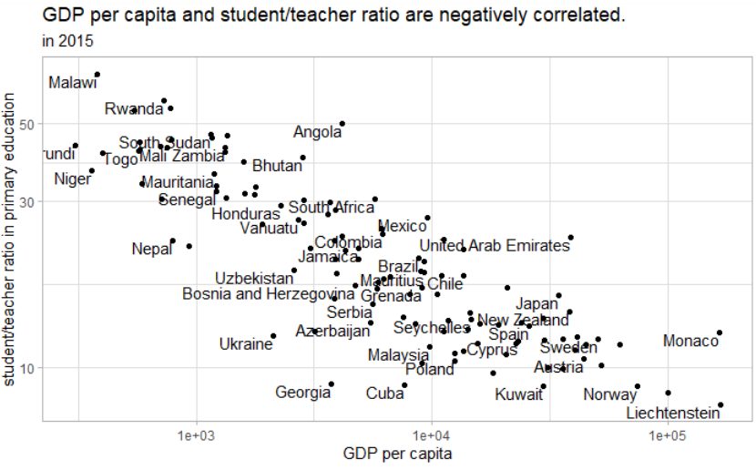
Step 4: Add color by region and size by total population. We can tell Sub-suharan African countries have lower GDP per capita and higher student/teacher ratio.
student_ratio_elementary_2015 %>%
  arrange(desc(total_population)) %>%
  top_n(100,total_population) %>%
  ggplot(aes(GDP_per_capita, student_ratio, color=region)) +
  geom_point(aes(size=total_population)) +
  scale_y_log10() +
  scale_x_log10() +
  geom_text(aes(label=country), vjust=1,hjust=1,check_overlap=TRUE ) +
  labs(x="GDP per capita",
       y="student/teacher ratio in primary education",
       title = "GDP per capita and student/teacher ratio are negatively correlated.",
subtitle = "in 2015") 
Step 5: Change the legend label format to comma style for easier read. Increase the contrasts of the dot sizes so that countries with bigger population stand out more.
student_ratio_elementary_2015 %>%
  arrange(desc(total_population)) %>%
  top_n(100,total_population) %>%
  ggplot(aes(GDP_per_capita, student_ratio, color=region)) +
  geom_point(aes(size=total_population)) +
  scale_y_log10() +
  scale_x_log10() +
  scale_size_continuous(label = scales::comma, range = c(.25,12)) +
  geom_text(aes(label=country), vjust=1,hjust=1,check_overlap=TRUE ) +
  labs(x="GDP per capita",
       y="student/teacher ratio in primary education",
       title = "GDP per capita and student/teacher ratio are negatively correlated.",
subtitle = "in 2015") 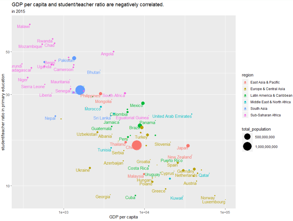
In summary, a great graph is well labeled and incorporates a lot of information in it. The most important criterion is that a great graph does not make the user think what it tries to show/convey.
Great information. Lucky me I recently found your blog by chance (stumbleupon).
I’ve bookmarked it for later!
Look into my homepage – Nwcasualclassics.online